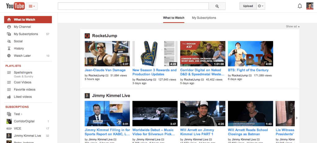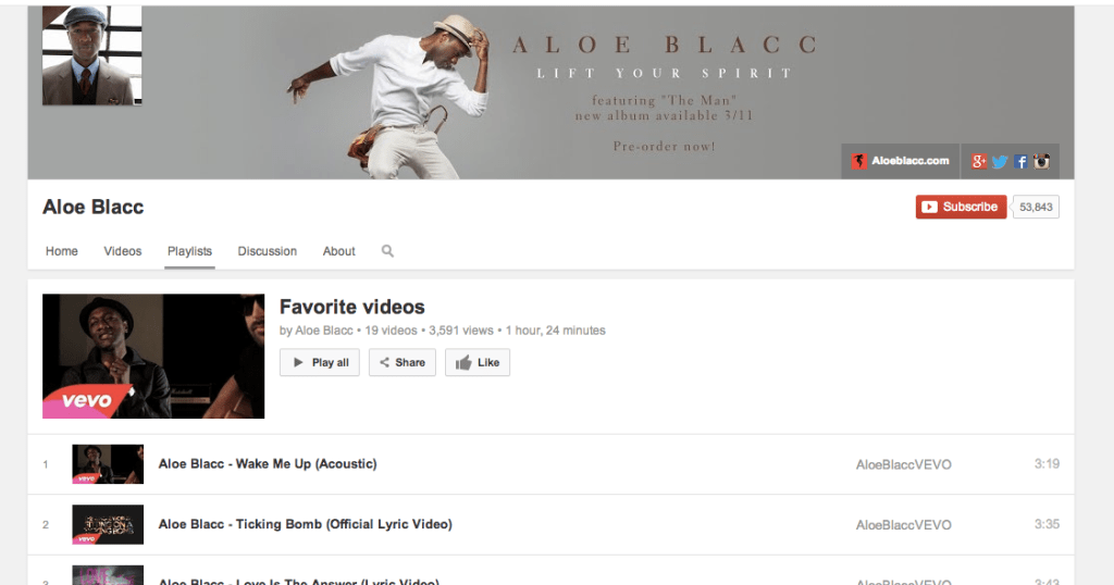
YouTube is rolling out a new design to its users today that takes its cues from the “card-like” design Google now uses on many of its other web and mobile apps. The aim of the redesign, Google tells me, is to emphasize playlists by putting them front and center in the left sidebar.
In addition, however, the company also center-aligned the site to make it look better on any screen and give it a “feeling similar to the mobile apps you’re spending almost half your YouTube time with.” This move allows it to easily employ the card look, which is clearly the main organizational metaphor for any Google product these days.
As part of this design tweak, YouTube also added new icons to the sidebar and introduced a new persistent menu button next to the YouTube logo in the top-left corner of the screen that will bring up the guide with playlists, subscriptions and everything else that’s usually in the sidebar. Overall, the site looks a bit fresher and brighter now and — thanks to some tweaks in the typography — quite a bit more readable.
As part of the emphasis on playlists, Google now shows you all of the playlists you have created and those from channels you liked in the sidebar. In addition, it now highlights playlists on YouTube channels with a new playlist tab. For those who want to create playlists, YouTube is also making it easier to do that. When you make a playlist now, YouTube will pop up a new page that lets you organize your videos.
The new design starts rolling out today, though it may take a few hours or even days before every user will see it.

Read more : YouTube Gets Google’s Card Design And Puts Stronger Focus On Playlists

0 Responses
Stay in touch with the conversation, subscribe to the RSS feed for comments on this post.