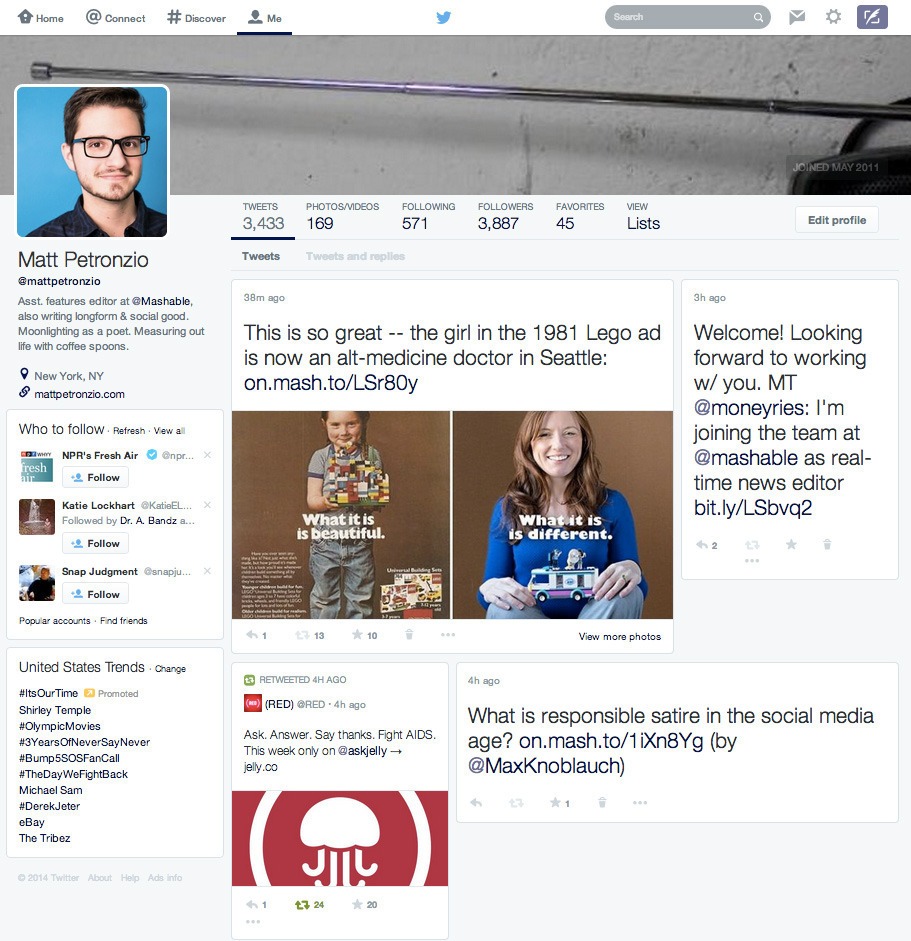
There’s a new Twitter redesign making the rounds, first spotted by Mashable’s Matt Petronzio, and it changes things considerably. Tweets no longer flow vertically in a single column like they do now, instead they spread out with a tile-style layout similar to what you might expect from a Pinterest or Facebook’s new Paper app. A separate new feature offers pop-up notifications with fields for easy replies for direct messages sent through the platform, and similar notices for RTs and favorites.
The features are being seen separately, but if both are implemented you start to get a picture of a future where Twitter moves away from its mostly single column, simple look to a richer, more complex presentation that offers up additional information, but in a way totally alien to what users are used to from the social network.
Twitter’s more magazine-style web layout would make for a media-friendly product that better highlights images and video, but at what cost? The feed then becomes somewhat unhinged from its original, linear and mostly chronological design, which is bound to affect interaction. There’s also a “View more photos” link which suggests more of a rich media discovery play in the works.
These may seem like small changes, but the way people use Twitter are tied deeply to its design. A single column of chronological tweets enforces a fundamentally ephemeral quality to Tweets published by users – they are born and live only briefly, quickly pushed down by other posts being put out. A multi-column spread increases the lifespan of Tweets, in a way similar in theory but different in execution to how the new Twitter practice of bubbling back up conversations attached to @-replies keeps back-and-forth engagement more top of mind.
The new pop-up notices are likewise tools designed to drive engagement, and seem to be implemented in a way that’s genuinely useful. It’s comparable to how OS X handles iMessages now, giving you the chance to respond instantly instead of having to actually wade into the app itself.
There have been some complaints already on Twitter, including some comparing this new vision for Twitter to Facebook, but as evidenced by the company’s most recent financial results, the social network needs to ramp up growth, and playing with interaction design could be the way to appeal to a wider audience. Of course, as always, this particular Twitter design is just a test as of right now, and the company’s tendency to experiment doesn’t always predict that will roll out widely.
Photo: Matt Petronzio / Mashable
Read more : Twitter’s Web Presence Might Soon Break Away From The Vertical Timeline Flow

0 Responses
Stay in touch with the conversation, subscribe to the RSS feed for comments on this post.