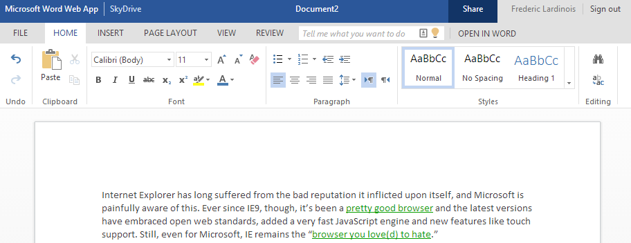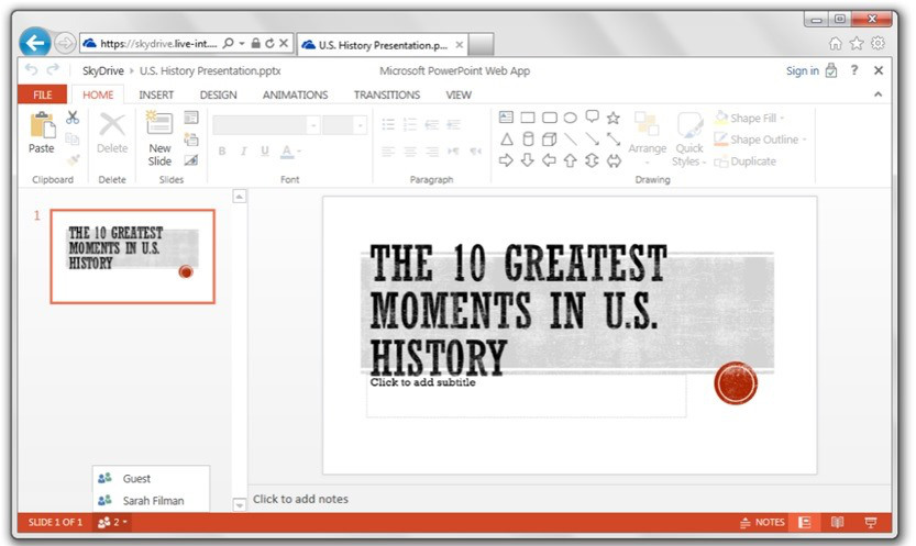
Microsoft is giving its Office Web Apps a new look today, it seems. While the company hasn’t done all that much to promote its Office Web Apps lately, they are pretty capable online versions of Word, PowerPoint, Excel and OneNote that are free for anyone to use. Today, the company is giving all of these apps a user interface overhaul that brings an even flatter design, some new features and easier navigation.
While Microsoft hasn’t officially announced these changes, the company has confirmed to us that it did indeed launch these updates earlier today.
“We did introduce some Office Web App updates earlier today,” a Microsoft said. “As we’ve said in the past, we’ll continue to bring the Office features that you value most to the Web and this is just one example of that.”
The most notable change – or at least the first one I spotted – is a new navigation for the OneNote note-taking app. It now uses two columns on the left to help you navigate between the different sections of your notebooks. Previously, that was a bit of a hassle.

Microsoft has also changed the design of the top menu across all the apps and cleaned up the design of the Ribbon menu across the board. The occasional semi-skeuomorphic icon remains in the Ribbon, but for the most part, the Office Web Apps have now gone completely flat.
As part of the update, Microsoft has also changed the header UI to include a switcher that offers access to other online Microsoft experiences.
One other change I noticed was that the Word and Excel apps now features a “Tell me what you want to do” search bar that lets you search across all of the app’s tools and invoke actions, such as bolding text or find and replace right from the search results. It uses type-ahead, so it generally just takes a few keystrokes to find the function you need. Microsoft says this tool will soon arrive in the PowerPoint web app, too.
Microsoft tells me that it also now allows users to add “polish to reports and papers with new footnotes & endnotes.”

Overall, the new design makes the Office Web Apps feel a bit more like the recently updated Outlook.com, which also features a similarly flat menu bar.
For comparison, here is what the old user interface looked like:

Read more : Microsoft Gives Its Office Web Apps A New, Flatter Look


0 Responses
Stay in touch with the conversation, subscribe to the RSS feed for comments on this post.