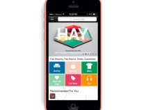
It’s been a busy few weeks for Fab.com. First the design-focused online retailer launched an updated Web site the same week it filed a counterclaim against JustFab in an ongoing legal dispute. Then Fab.com co-founder Bradford Shellhammer announced that he was leaving the company. Now its back to business as usual for Fab.com with the latest rehaul of its iOS and Android apps.
The update is designed to complement Fab.com’s new Web site, which seeks to offer better product suggestions for individual shoppers through social recommendations and collaborative filtering. Company spokeswoman Deborah Roth says that personalized recommendations will be the same for the most part on mobile and Web. The only key difference is that on the Web, recommendations are sorted into categories, while the apps simply shows a list of personalized items because Fab.com felt that would provide a better user experience on mobile.
“One interesting thing to note is that we’ve spent a bit of time optimizing for those who use Fab on both web and mobile. When an individual logs in from multiple devices we’re tracking how they use Fab on each of those devices, and then we use that information to personalize their experience across all those devices,” says Roth. “If you start browsing with the app now then in a few hours you might notice that what you viewed is influencing the items we recommend for you on web, and vice versa. Our personalization tech is designed to work in unison across all your devices.”
The other most noticeable change to the apps is the organization of information, which is now designed to be easier to navigate. The top navigation bar has been removed and the most popular categories are n ow on the home page to encourage more people to click on them.
“The UX on mobile is MUCH more simplified than prior versions, with the goal of getting the user down to a list of products as quickly and efficiently as possible due to the small screen size,” says Roth.
Fab.com regularly tinkers with the UI of its apps, releasing new versions every few months. Its emphasis on mobile makes sense considering that a third of its visits and sales originate on smartphones and tablets. In June, the company announced that it was transitioning its business model from flash scales (which it said are difficult to scale internationally) to a design-focused lifestyle store. This was the latest in several pivots for the company, which launched in 2011 as a gay social networking site, so it makes sense that it is aggressively honing in on mobile in order to ramp up its sales. Fab.com is also focusing on expansion in markets, including Southeast Asia, with especially high rates of mobile penetration. In July, it announced that it raised $10 million from Singtel, the Singaporean telecom giant.
Read more : Fab.com New Mobile Apps Focus On Personalized Product Recommendations

0 Responses
Stay in touch with the conversation, subscribe to the RSS feed for comments on this post.