shopfront: the front side of a store facing the street; usually contains display windows (Dictionary.com)
Yahoo’s search app Axis, launched earlier today, is being marketed as “a new kind of browser.” It’s not a browser though, it’s an app that is available on PC, iPhone and iPad. On the PC, it’s a plug-in (which is a type of app) for actual browsers, like Google’s Chrome and Apple’s Safari. So what is Axis, exactly? It’s a new shopfront to entice people to use Yahoo. Yahoo has always been a shopfront, from the online directory in the mid-90s to the personalized homepage of the past few years. What’s different about this new shopfront is that it’s a group of apps, instead of a webpage. The question is: will people use it? Let’s give it a test drive…
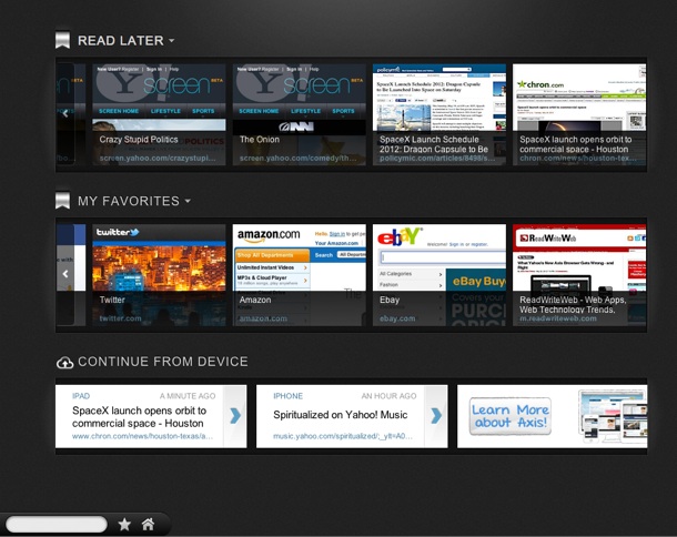
The main feature of Axis is search. In the apps, you search for things – just like you would on yahoo.com or google.com. A key part of Axis is that it syncs a user’s search activity across computer, iPhone and iPad. It also taps into one of this year’s biggest trends, the Visual Web, by showing visual previews and promoting sharing via image-based social network Pinterest. Another noteworthy feature is its “personal homepage,” where you can save articles and webpages.
Axis in Action
When you start using Axis, it becomes apparent that Yahoo is prioritizing its own web properties in search results. For example a search I conducted on my iPhone for “Spiritualized” (a British band I’ve come to like) had a Yahoo Music page as the first result. This is a dangerous practice for a shopfront. People expect a search engine to be unbiased and to provide the best result first. Sure, Google has flirted with its users’ trust too, by ranking its own properties like YouTube and Google News high in search results. But Axis takes it a notch further, by nearly always making a Yahoo property the top search result.
Despite the bias in search results, Axis is a slick product and feels great to use. The visual previews are attractive and it makes searching fun. The Axis iOS apps are also very well designed, for example using swiping navigation effectively.
The so-called “personal homepage” is disappointing. This is supposed to be a home page for you, where you can access websites and pages that you have bookmarked. But for a company which prides itself on its personalized portal, My Yahoo!, the Axis homepage feels bare and unoriginal (“Read Later” – why would I want to use that, when I have Instapaper or Pocket?).
The sharing functionality in Axis is also curiously threadbare. Only Pinterest and Twitter are available. The biggest sharing service on the planet, Facebook, is nowhere to be seen. I also found the Pinterest functionality to be buggy on iPad – it attempted to open the iPhone app for Pinterest first and only after various closing and cancel clicks, did the iPad version of Pinterest display.
The Verdict
So does Axis stand a chance against Google (the search king), or Facebook and Twitter (where millions of people discover content these days)? Axis is a slick product and the sync functionality is nifty. But there are a couple of main reasons why Axis won’t take off:
- The search is too biased. It may appeal to heavy Yahoo users (of which there are still millions), but it won’t appeal to others.
- The plug-in and app paradigm is very dependent on people a) downloading the plug-in and/or app; and b) opening the app regularly. The browser plug-in at least is persistent, via the search box that displays in the bottom-left of every webpage you’re on. But iOS apps need to be manually opened and very few of them are every day. I can count on the fingers of one hand the number of apps I open on a daily basis, on either iPhone or iPad. Also it should be mentioned that this is iOS-only at this stage, another limiting factor.
I applaud Yahoo for trying to adapt to the mobile era with a well-designed group of apps. This is the Yahoo we all want to see: one that innovates with technology, instead of in-fighting and trying to make money with patents.
Pages: 1 2


Recent Comments