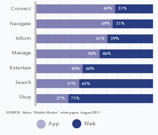
“I believe the shift toward apps is about user experience.”
Benjamin Sandofsky, Tech Lead on Twitter for iPhone, iPad, and Mac
Apps vs. The Mobile Web. It’s often presented by the media as an either/or, winner-takes-all proposition. Usually accompanied by an “X is Dead” headline. Wired Magazine (in)famously declared that “The Web is Dead” in 2010. Yesterday I playfully pronounced the death of apps. Of course neither the Web or apps are dead – or resting, for that matter.
Yesterday I argued the case for HTML5 websites over apps, noting that it’s become a trend in 2012. However, sometimes an HTML5 website for a mobile device just won’t cut it. Especially if you want to create a great user experience.
Twitter’s Benjamin Sandofsky recently penned two compelling arguments for apps. They are technical articles, written for a developer audience. The takeaway lesson for the rest of us is that apps are often the only way to build “great products.”
Sandofsky convincingly argues that the best user experience for Twitter on an iPhone or iPad is an iOS app designed for each device.
Twitter has apps, but it also has a very good mobile website too. Here is a comparison of the iPhone app (on the left) vs. the HTML website (on the right):
There isn’t a lot of difference, but the native iPhone app is slightly faster and a bit prettier.
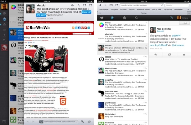
The difference is more marked in the iPad app (on the left, below), which is a much better user experience than Twitter’s mobile website on an iPad (on the right). The app is noticeably faster, has extra functionality, is more beautiful and has whizzier navigation.
In my case, I choose to use the Twitter apps for both iPhone and iPad – because the apps do have a better user experience.
Bottom line: the choice an online business makes between an app and an HTML5 website is dependent on the type of product or service it has. Whereas magazine publisher Technology Review opted for HTML5


0 Responses
Stay in touch with the conversation, subscribe to the RSS feed for comments on this post.