 The news comes today that LinkedIn now has 100 million users.
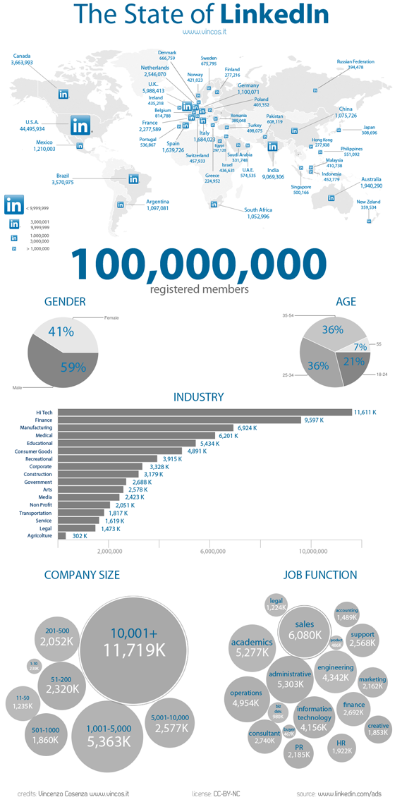
We have two infographics to show the growth and what it represents. LinkedIn created its own infographic and the Italian blog Vincos has a number of other nuggets of interest in an infographic of its own.
LinkedIn’s infographic has some data points that fit with the infographic genre:
- The professional networking service is seeing an average of one million users per week.
- Stack 100 million business cards and the pile would rise 98,425 feet.
- Growth is fastest in Brazil by a factor of four.
- In a 24-hour period, mobile usage is highest at 5 p.m. PST.
- eBay, EMC and Amazon are some of the most represented companies.

Vincos takes a bit of a different perspective:
- 61% of members are men.
- The most represented industries are high tech, finance and manufacturing.
- Sales, academic and administrative functions are the most common job functions.
These are two infographics that show LinkedIn’s growth. They demonstrate how much we depend on services to grow our businesses and network in communities of interest.


0 Responses
Stay in touch with the conversation, subscribe to the RSS feed for comments on this post.