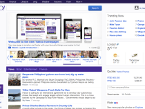
Marissa Mayer’s repainting of Yahoo’s ‘front door’ has expanded its international reach, with the “more modern” looking homepage now being rolled out to seven global markets, six of them in Europe. The new-look homepage debuted in the U.S., back in February.
The spruced up portal is now available in the U.K., Ireland, Germany, France, Italy, Spain and South Africa, Yahoo said today in a blog post.
That still leaves a large swathe of Yahoo’s international markets sticking with the old look homepage, with only the recently redesigned Yahoo logo to hint at Mayer’s ongoing internal makeover of the long-toothed Internet company.
Here’s the current Yahoo India homepage, for instance:
And here’s the new, cleaner-looking Yahoo Spain:
As with the U.S. overhaul, the new-look Yahoo homepage packs in more content than before but does so in a way that feels a bit less hectic – with a focus on keeping the overall look uncluttered, despite increasing the amount of data on tap.
The new homepage also includes a real-time news feed with a ‘save for later’ function; a stack of new utilities; and spotlights that act as widget-sized windows onto other Yahoo services, such as Yahoo Weather, Finance and Flickr. The displayed widgets can be customized by individual users.
Despite this new lick of paint there’s no disguising that Yahoo’s homepage is still a portal – and web portals were cutting edge circa 15+ years ago. Making this ‘front door’ to the Internet relevant now, in a digital environment dominated by mobile devices where users don’t need so much hand-holding and simply cherry pick their favourite apps, is of course Mayer’s big challenge. Or one of them. ‘Making Yahoo relevant again’ sums up her chief challenge.
Although the new Yahoo homepage is designed to work across desktop and mobile devices, with smartphone and tablet optimised versions, getting users to actually visit it on their mobile devices is another matter.
Yahoo said today that it will be continuing to tweak its new international homepages “over the coming months” – to “make changes and improvements”, presumably as it seeks to find the stickiest combination of widgets.
Yahoo is also continuing to spruce up other portions of its existing estate, giving its finance service a new lick of paint last week, for instance, and overhauling Yahoo Mail in October.
Under Mayer, it’s also been on a hiring spree – buying up a swathe of startups, including Summly and bread, and most recently signing up former New York Times technology journalist David Pogue to work on a forthcoming Yahoo consumer tech website.
It’s still not entirely clear whether the Yahoo that emerges from all this updating will mostly just have a fresh lick of paint, or whether Mayer has more radical plans for reinventing the business that involve significant shifts of focus.
Read more : Yahoo Finally Takes Its New-Look Homepage Global, Bringing It To Seven Int’l Markets

0 Responses
Stay in touch with the conversation, subscribe to the RSS feed for comments on this post.