It’s time for Bing’s big headline. Today Microsoft takes the wrapper off the new Bing, for which the cleaned-up redesign a couple weeks ago was just a preview. For signed-in Facebook users, Bing now has a social search component that should send Google back to the drawing board. It’s called Sidebar.
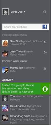
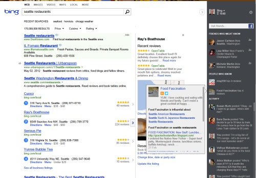
Sidebar is the most novel component of the new Bing. It’s a mellow, gray sidebar that is closed by default. It shows a thumbnail of your picture and two control icons, and that’s it. There’s a hint arrow to expand it. When you open Sidebar, it shows you stuff from social networks that’s relevant to your search.
If you have Facebook friends who might have an answer to your search query, they’ll be listed there. It also shows you “people who know” about the subject from all over the Web, not just from Facebook, but from Twitter, LinkedIn, Quora, Foursquare and, yes, Google+. You hear that, Google? Microsoft’s social search bar searches all our social networks.
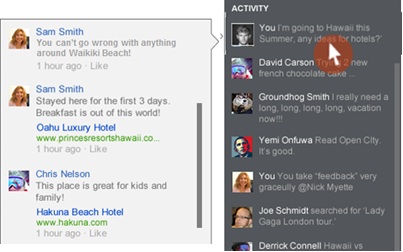
Sidebar also shows an activity feed for Bing-related Facebook news. So if your friends are helping you find hotels in Atlanta, for example, your Sidebar will show those conversations for reference.
There’s also a Facebook share box right in the Sidebar, which will allow you to share your searches as a Facebook post if you want. So if you really need help looking for something and want to enlist your Facebook friends, you’ll be able to share the search with them. An upcoming feature called Broadcast mode will share all your Bing searches on Facebook automatically, if you’re into that sort of thing.
Coming Up Next: Snapshot
The next big feature coming to Bing Search is called Snapshot. It was there for a while in the demo, and I wish it was live now, but you’ll get to see it soon. Snapshot will complete the clean-up of Bing’s search results that started a couple weeks ago.
Snapshot will be the best demonstration of Microsoft’s “entity engine” called Satori, the technology that lets Bing identify and describe things by mapping things on the Web that refer to them. It pulls together all kinds of information about the thing you’re searching for, including images, maps, products to by and so on.
Google was the first search engine to start rolling multimedia stuff right into the search results. Google’s Universal Search displays images, videos, maps, ticket info and all kinds of other information mixed in with the Web links. When Bing launches Snapshot, it will move all that stuff into a second column, so the first column is nothing but nice, clean Web links, just like we used to have.
So if you search for “Kiss tickets” on the new Bing (once Snapshot launches), all the websites will show up in an orderly list of links on the left, venue maps and ticket prices will fill in a separate column on the right, and all the way on the right edge of the screen, you’ll be able to check if your friends are going.
Snapshot will also be amazing for people search. Google wants to solve searches for people by showing you Google+ profiles, but that’s just another identity to maintain. Today, Bing uses your Facebook profile as a hub for its Linked Pages. Eventually, Snapshot will be able to pull all those pages together as its own kind of search result. No profile necessary.
Taking Google to UX School
The new Bing works in exactly the right way. It disentangles the many kinds of information we get from search instead of mashing them all together. There’s no awkward toggle switch between “social” and “global,” even though Google’s idea of “global” is still personalized. Bing has one set of Web links, one set of related results, and social info lives in the sidebar.
Bing Search Director Stefan Weitz made sure to point out that it’s not just called “Sidebar” because that’s the Web design term for it. It’s a sidebar like in a courtroom, a private counsel with your Facebook friends, with conversations from the whole social Web admitted as evidence.
There are so many ways in which Google’s Search Plus Your World gets that wrong. The most obvious is the way Google privileges posts on its own social network inside main search results. It has every right to do that, but Bing’s cross-network results are much better. But social search results also belong on the side, with the straight-up Web as the main event.
This new Bing is just better organized than Google, and that will help it expand naturally to all devices, “including the Xbox eventually,” Weitz says.
Read more : The New Bing Makes Google Look Anti-Social


0 Responses
Stay in touch with the conversation, subscribe to the RSS feed for comments on this post.